Selected Project
Puke Ariki
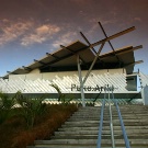
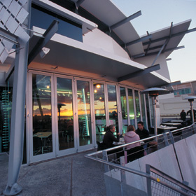
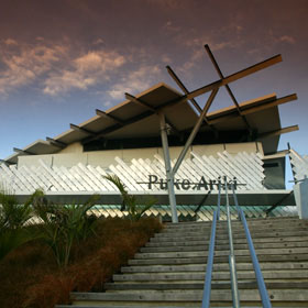
Client brief The New Plymouth District Council required a retrofit of the 5-level, 5500m2 1960s War Memorial Building to provide library space, archive, administrative/staff facilities and part-museum display. In addition, the brief required 5000m2 dedicated museum accommodation and a merging of the Taranaki archives of both museum and library. Architectural statement The rationale was to drape the new building across the site towards the sea, thereby meeting the demands of accommodation, and to have it rise up out of the ground. “Puke Ariki” refers to an earlier landform and pa - the hill of chiefs – which in the 1880s became the seat of colonial government in Taranaki. The new building, therefore, would re-establish the strategic height of the former hill, placing the forecourt / Marae Atea 4.5m above existing ground level. The Maori Taonga Gallery, with a whare like roof and nudging away from the building’s grid, took the uppermost location. The existing commercial “Wilkinson Façade” was retained to trace the edge of the former hill and the pre-reclamation coastline. A new building emerged, under a roof that gestures arrival from the sea, with a shapely foyer, galleries stacked three high and an umbilical aerial bridge across the street to link it to the existing 1960s building. Again echoing the soft curve of the original bay, a 70 x 6m tall woven wall defines and embraces the external eastern space providing a feminine element. Construction materials and systems elsewhere in the buildings are simple, robust, industrial and generally masculine – steel, metal, concrete, glass and elaborate single-skin EPS cladding. Inside, space arrangements significantly break away from the formal tradition of library and museum layouts. The former five-levels of the old building gave way to a four-storied void. The original concrete floors were removed and new stairs and an escalator were installed. Views and natural lighting are nurtured by the removal of book stacks from the external walls and the resulting ‘lightness’ is enhanced by a white interior. In the new building, the three-storied galleries and circulation spaces merge into an overall grey/black ‘theatre set’ enabling the display and exhibitions fitout to stand alone and not have to compete with the architecture. The expressed, raw structure of both buildings and the exposure of power, data, HVAC ducts, trunking, cable trays and reticulation are the result of a cost-driven design philosophy established at the outset. The district visitor information centre/retail shop and café facilities complete the visitor experience.
- Category
- Community & Cutural
- Location


