Selected Project
Masons Renovation
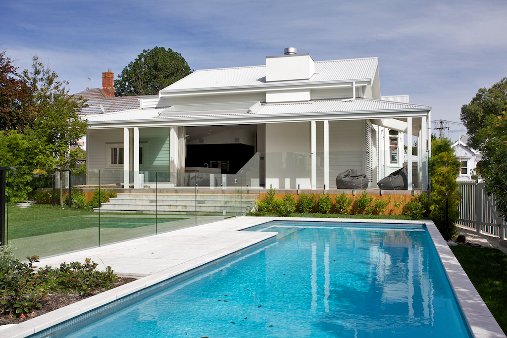
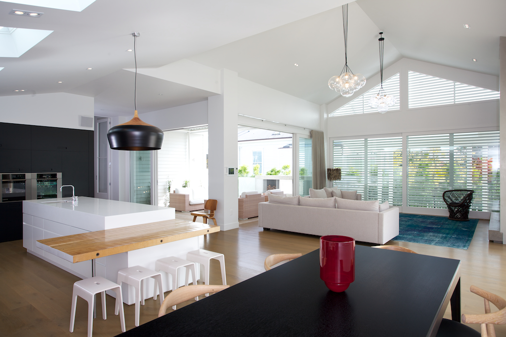
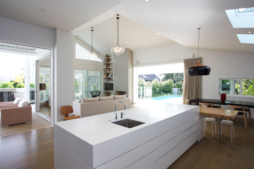
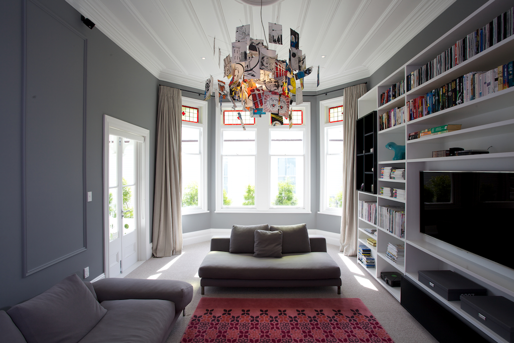
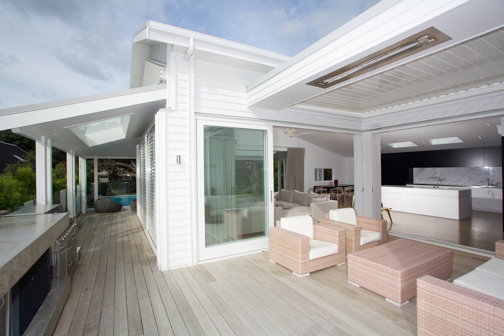
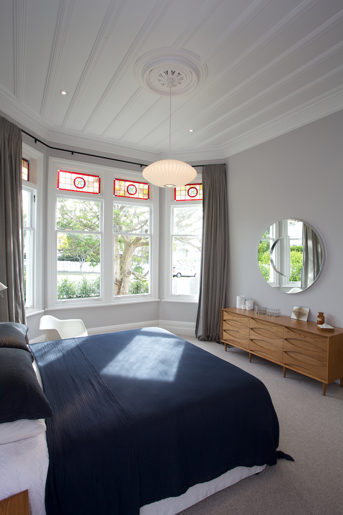
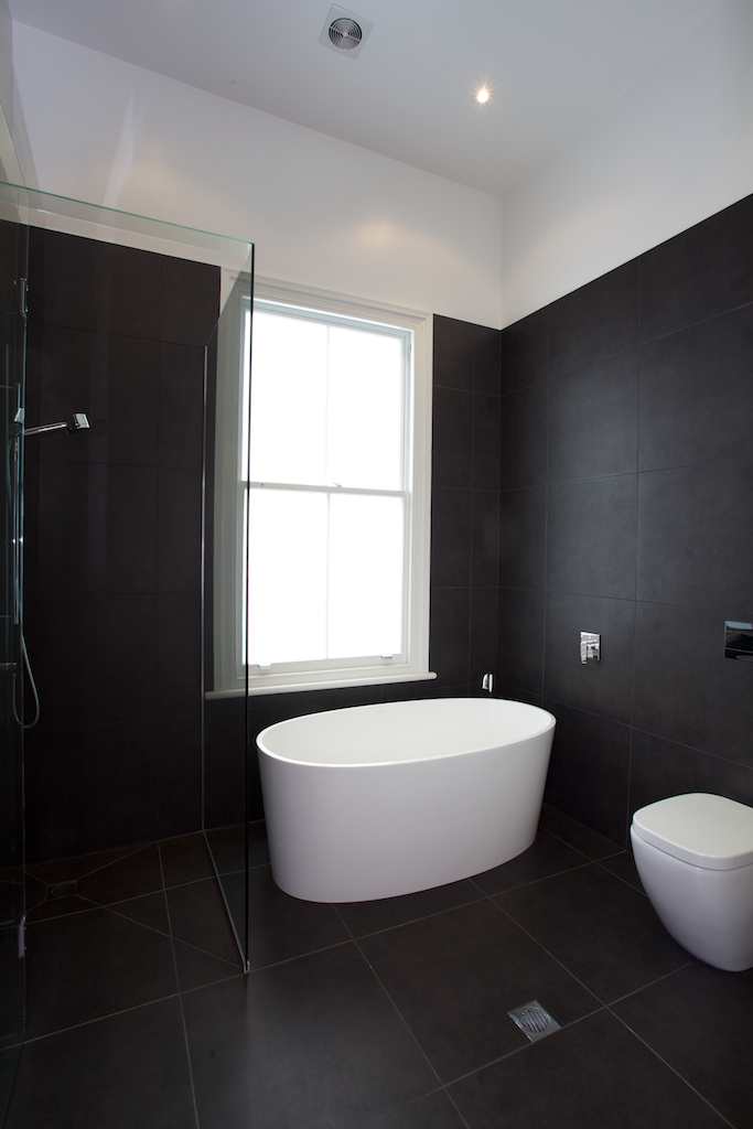
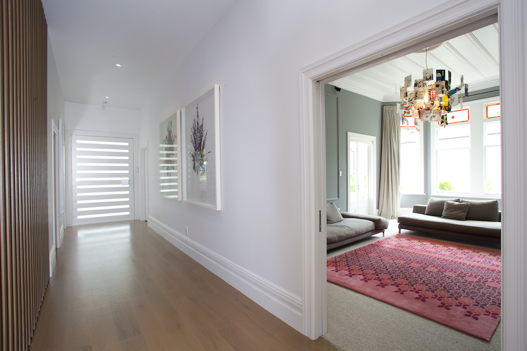
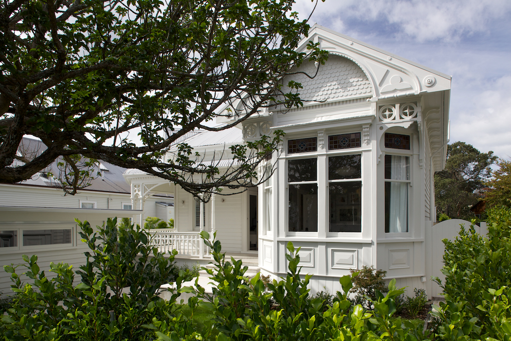
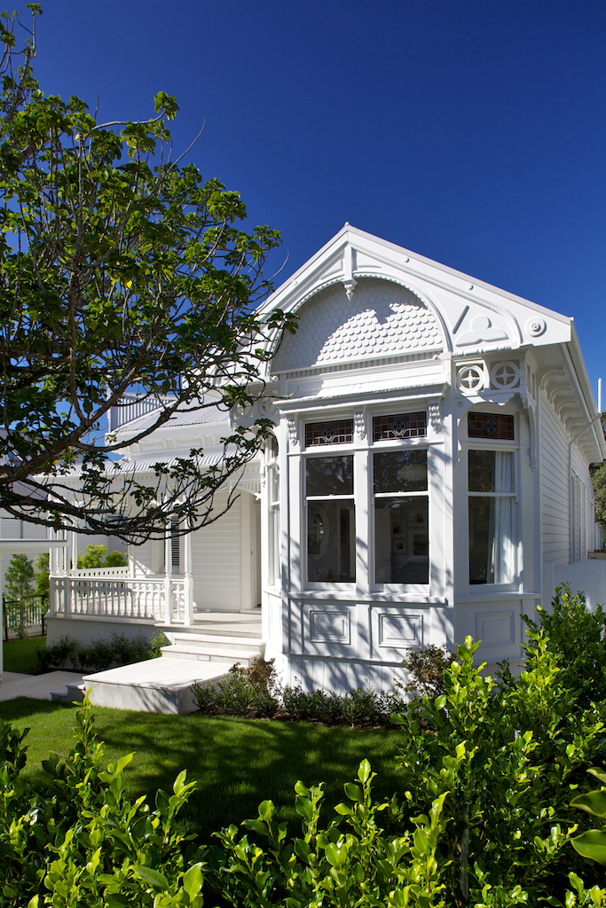
Even in the early 1900s, architects knew a thing or two about street appeal. The traditional villas and bungalows they designed had character in abundance and often featured return verandas, bay windows and intricate fretwork. Around the back it was another story, however, with small, dark kitchens and a total absence of any kind of indoor-outdoor flow. This house was typical of the genre – attractive at the front and a nightmare at the rear. The house did have many good features. It had plenty of character at the front – lovely windows, high ceilings, intricate detailing, and a wide hallway. But it needed to be restored to its former glory. It was also not well suited to modern living. Extending the house at the rear was the logical option and a way to gain extra space without compromising its architectural integrity. In designing the addition, we took our cue from the return veranda, replicating this form with a modern interpretation. The extension, which has nearly doubled the size of the house, features its own return veranda that extends the entire length of the house. It also has a similar gabled roofline. The interior was given a much more contemporary treatment, as you will see on the following pages. Now, there is a clear transition between the old and the new. The old part of the house accommodates the bedrooms, bathrooms and a den; the new extension holds, the kitchen, dining and living areas.
- Category
- Residential Architecture - Houses
- Location
- Auckland


