Selected Project
McSherry Building
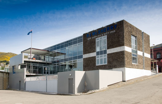
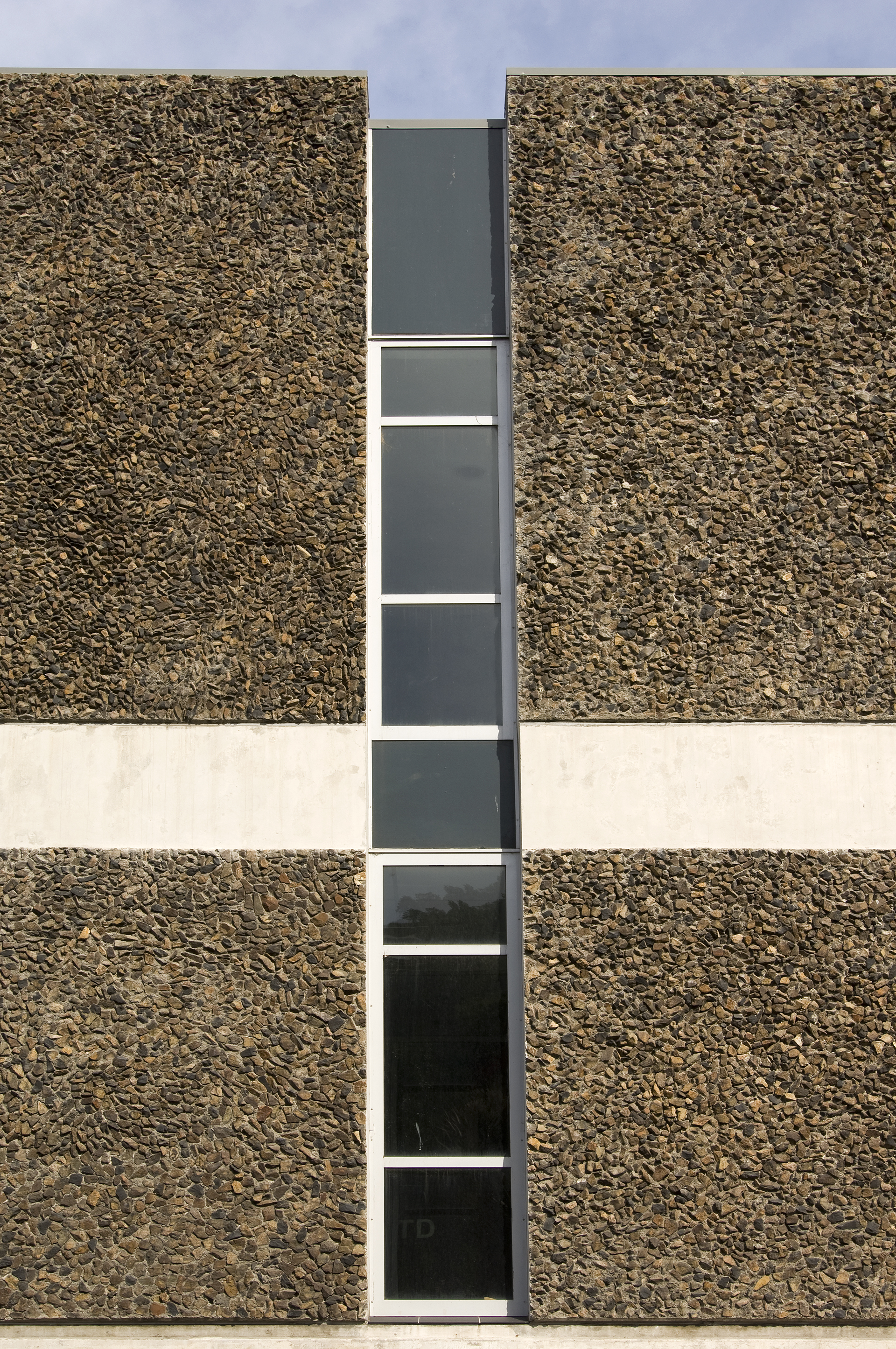
The site was the former location of the foreshore. Just under half of the site is occupied by the three storey Victorian Gothic former Lyttelton Harbour Board dating from 1880. This is a building with a grand past but was in a state of disrepair. The brief involved the refurbishment of the Historic Building into café / gallery, office and residential functions and a significant addition of 3 storeys of commercial space. Our client occupies the ground floor of the new building for their offices. The first floor of the new building is taken up by a series of smaller tenancies all with a port related function. The design solution integrates the new and historic building completely from a functional and earthquake strengthening point of view. Yet with regard aesthetics and massing the new building is clearly delineated from the old. Enclosing external walls of precast concrete with a locally quarried stone chip both link the new building to its local context and provide a solid and permanent solution to the port environment. Defined negative joints in full height curtain wall create a clear junction at the interface between new and old. Some elements of the existing inform the new elevations with tri-partite window groupings and horizontal plaster mouldings informing the new work. A two storey double glazed curtain wall captures the great views over the port and to the peninsula ranges beyond. The building opens to the waterfront in contrast to most adjacent buildings which turn their back on the port. The main entry to the new building slips between one the precast bracketing walls and the eastern façade of the historic building with a lineal canopy providing emphasis to this new entry from the township. The interior employs a simplified commercial language with some poetic elements such as the rusty steel reception counter, the bright blue walls referencing the Clients corporate colours and some interplay between the rear wall of the historic building as it becomes visible within the new. A heritage focussed internal colour scheme delineates the old building from the new which has a more crisp contemporary palette.
- Category
- Commercial & Industrial
- Location


