Selected Project
Westpac The Terrace
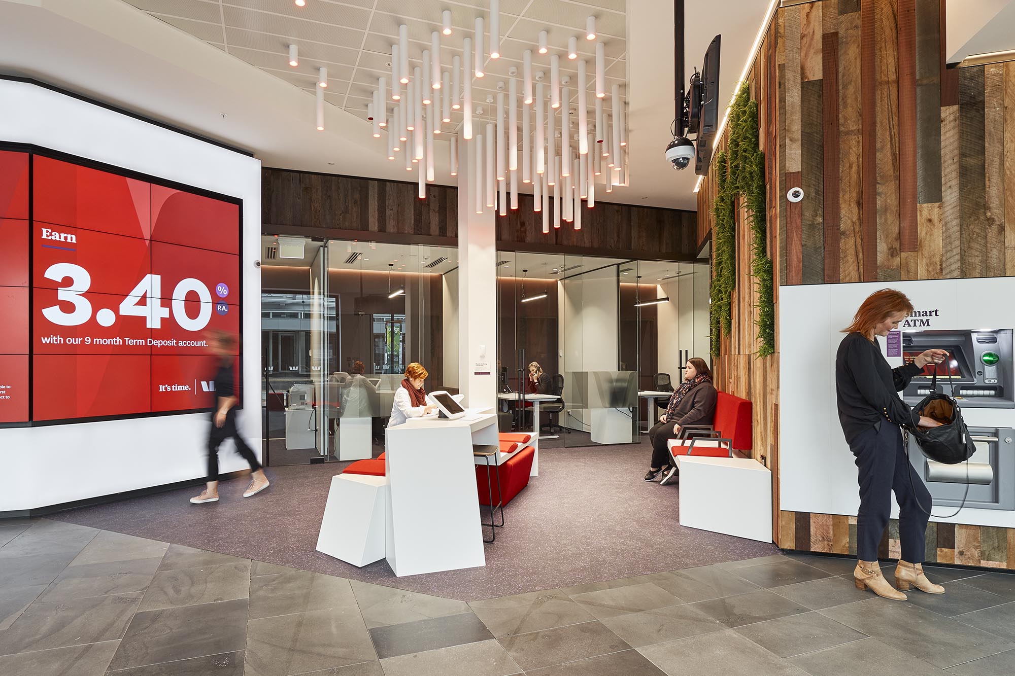
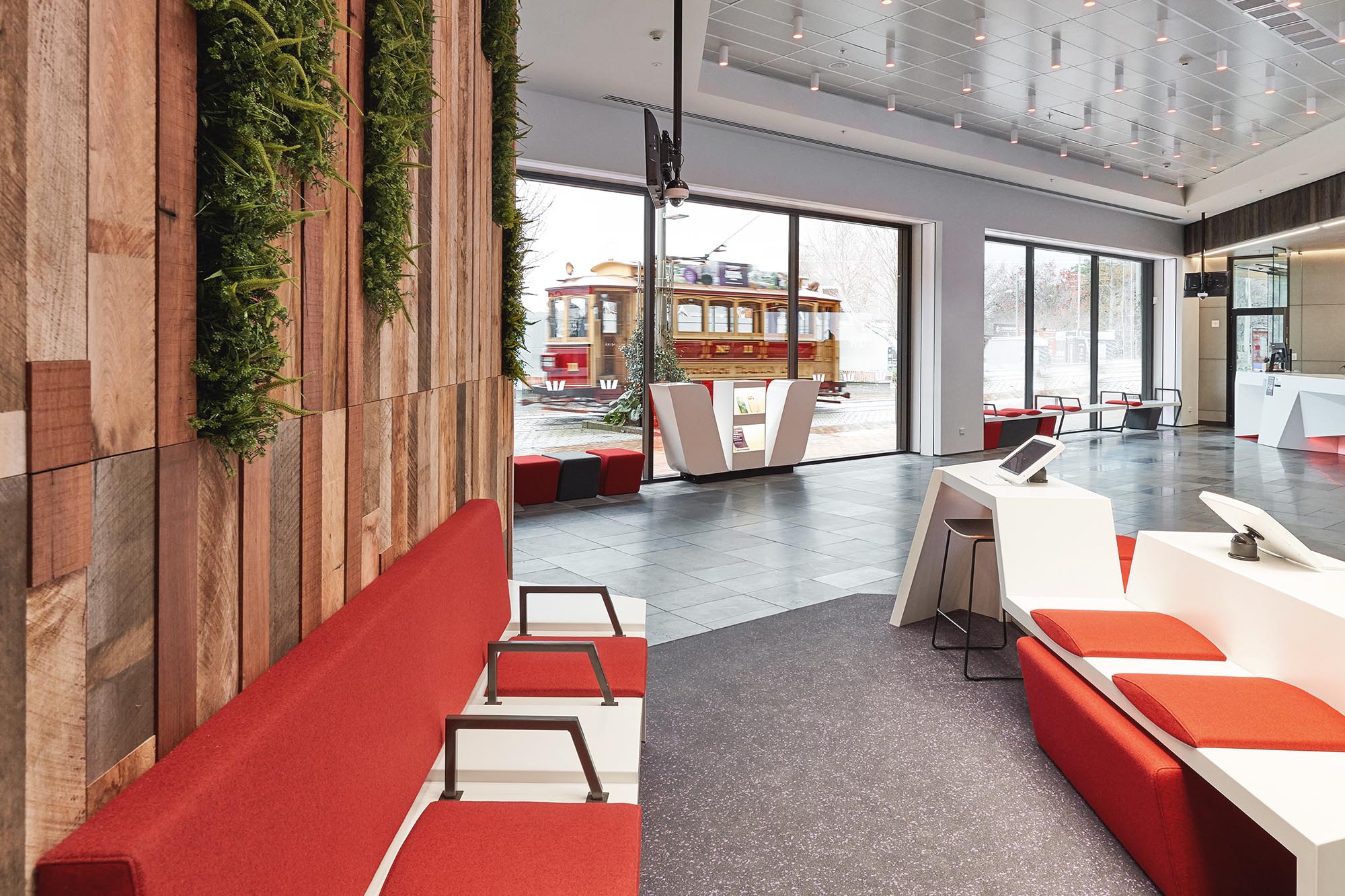
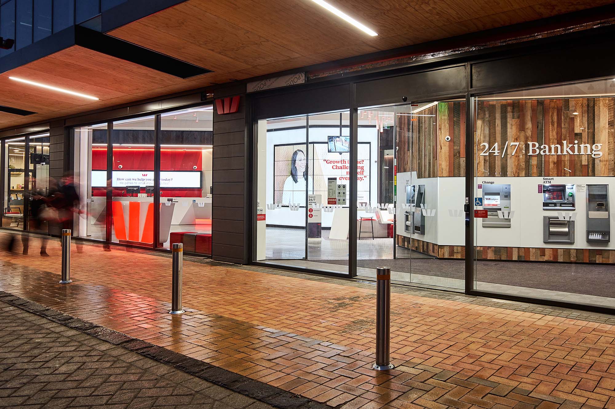
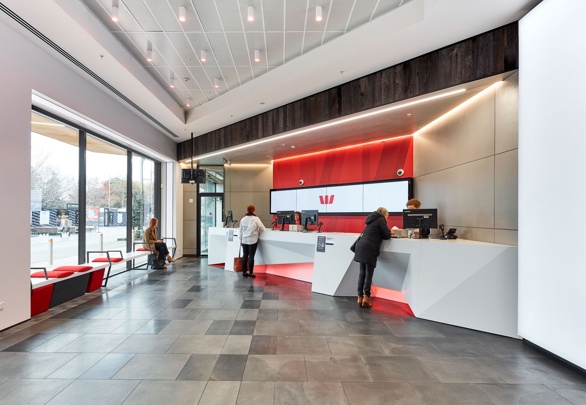
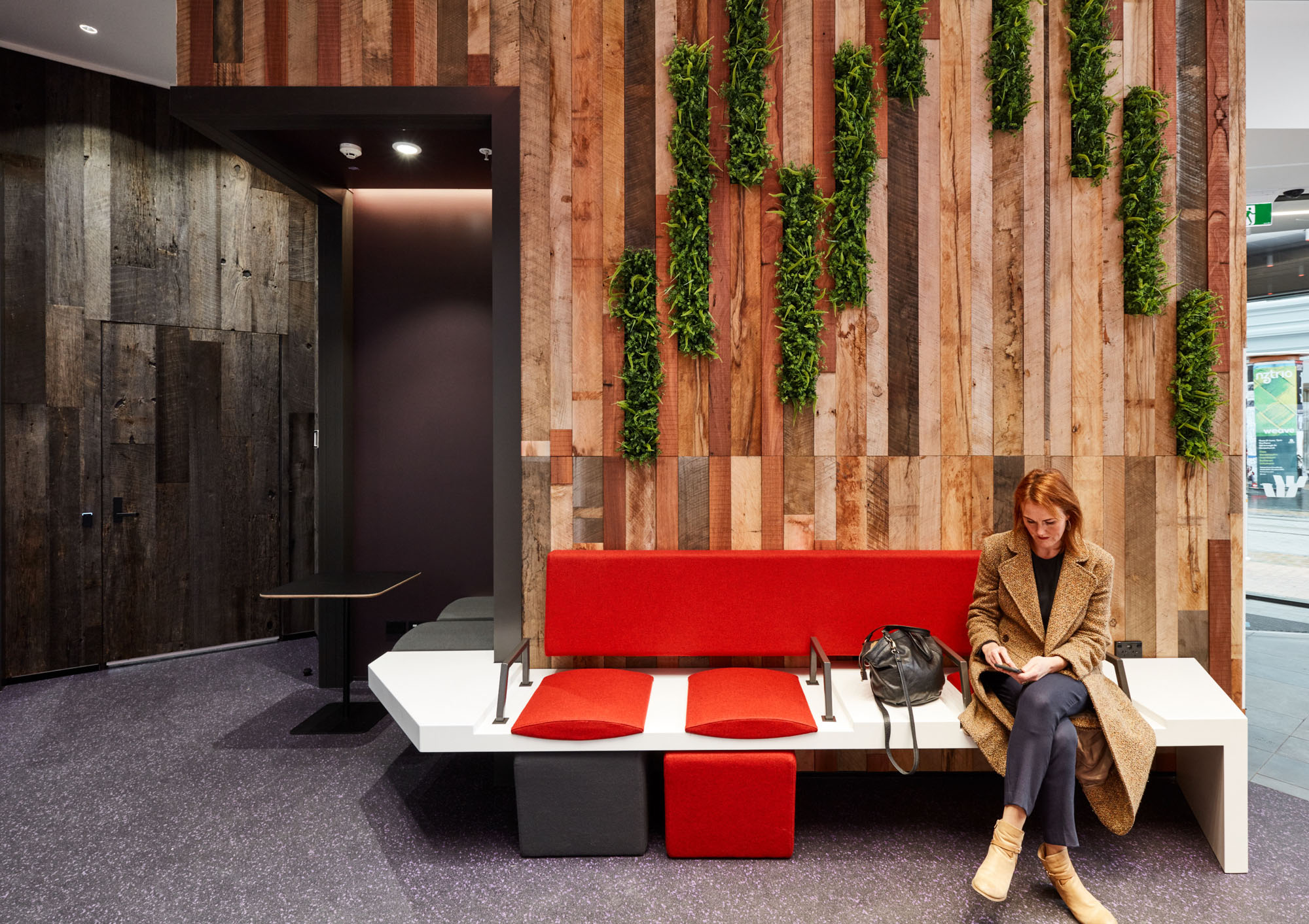
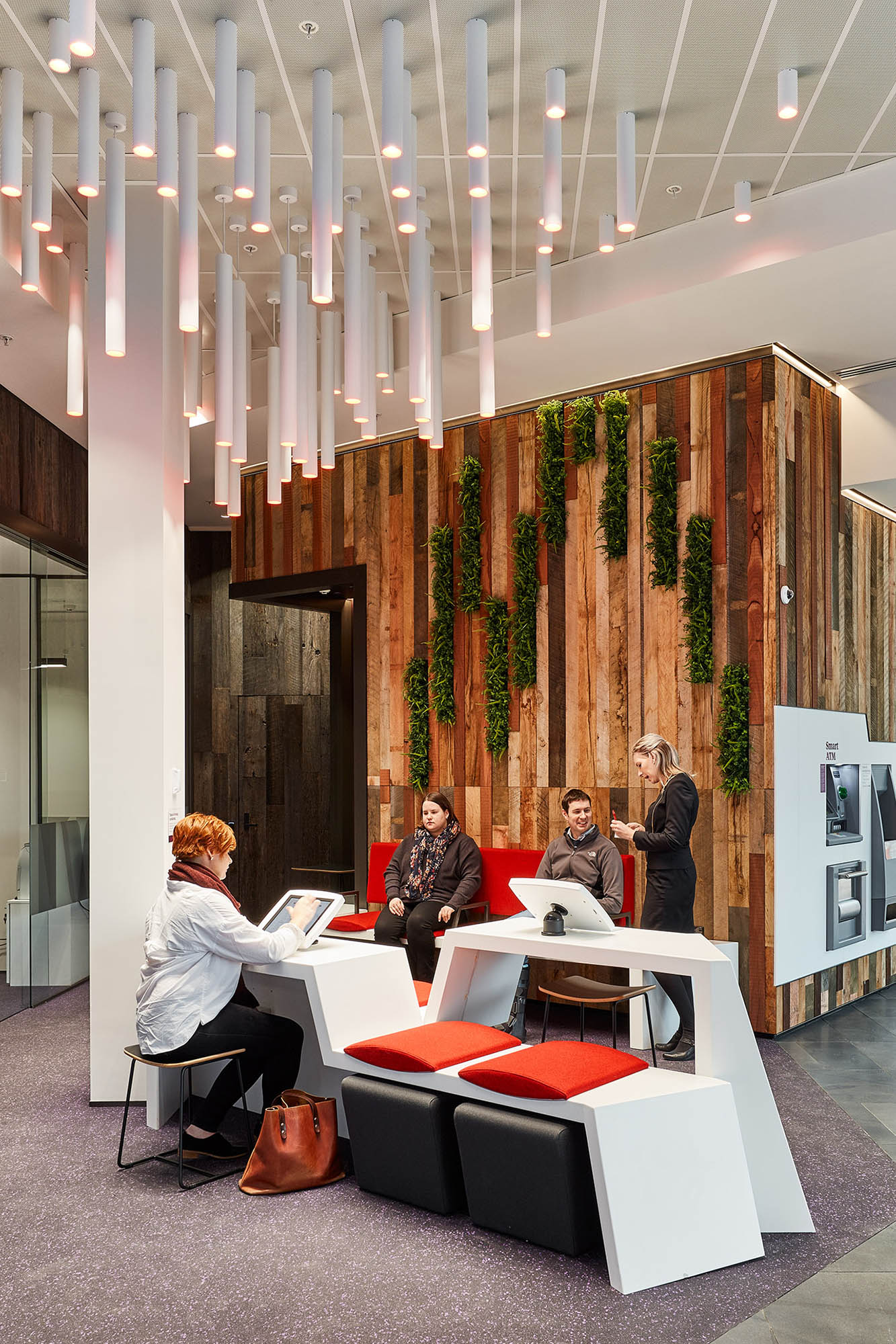
This flagship branch explores big ideas. A dynamic environment that shares its space with the city, it includes measures that will keep staff safe. City plazas that fizz with urban life are a feature of Christchurch’s regeneration masterplan. One of them – The Terrace, a $140 million riverfront development at the heart of the city – is home to Westpac’s newest flagship branch. The five storey building is a homecoming statement that will accommodate 114 staff. To meet the brief’s first challenge we both invited the plaza in and reached out into it. Over 30 metres of floor-to-ceiling glass façade brings the energy of the city into the retail space. The reclaimed-timber wall – a visual reference to the rebuilding of Christchurch – extends out from the lobby into the public realm; the stone floor echoes the tones of the plaza’s paving. Seating modules can be rearranged for evening community events, giving the space another way to engage with the city. At night the digital wall’s 14 sq metre square metre screen adds to the plaza’s neon bustle (the screens will show educational content and promotional clips). Staff safety was the second challenge. We designed counter heights, depths and fixtures to minimise risks tellers might face from unpleasant behaviour. Meeting rooms have a discreet staff-exit door, giving safe passage from confrontation. We designed for an efficient customer experience. The floorplan is based on task-defined zones: a thirty second ATM trip, a three-minute interaction with a teller, a 30-minute meeting with an adviser. There’s a concierge desk to help customers find what they need. Ceiling lighting mimics tree-canopy dapple and cascade down to meet a sculptural seating-and-desking island. The materials soften – from hard surfaces to carpet and upholstered seating – as you move into the branch. Aubergine-hued meeting rooms feature acoustically absorbent felt wall panels. Exterior signage is minimal, discreet: the lobby’s energy projects the brand. The highest praise came from the Westpac team, no strangers to the cut-and-thrust of fast-track branch fitouts.
- Category
- Interior Architecture
- Location
- Canterbury
- Year
- 2018
