Selected Project
Barrington
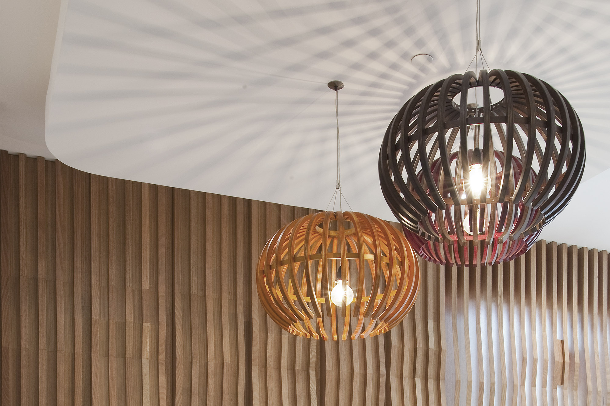
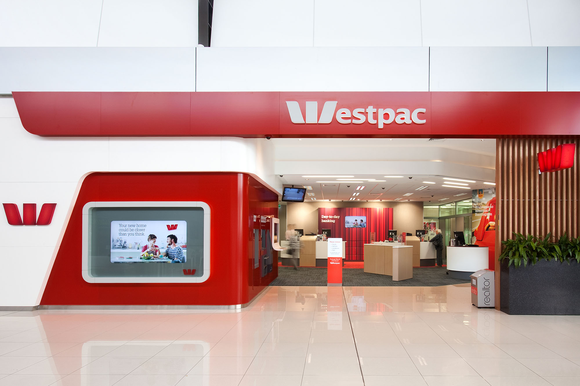
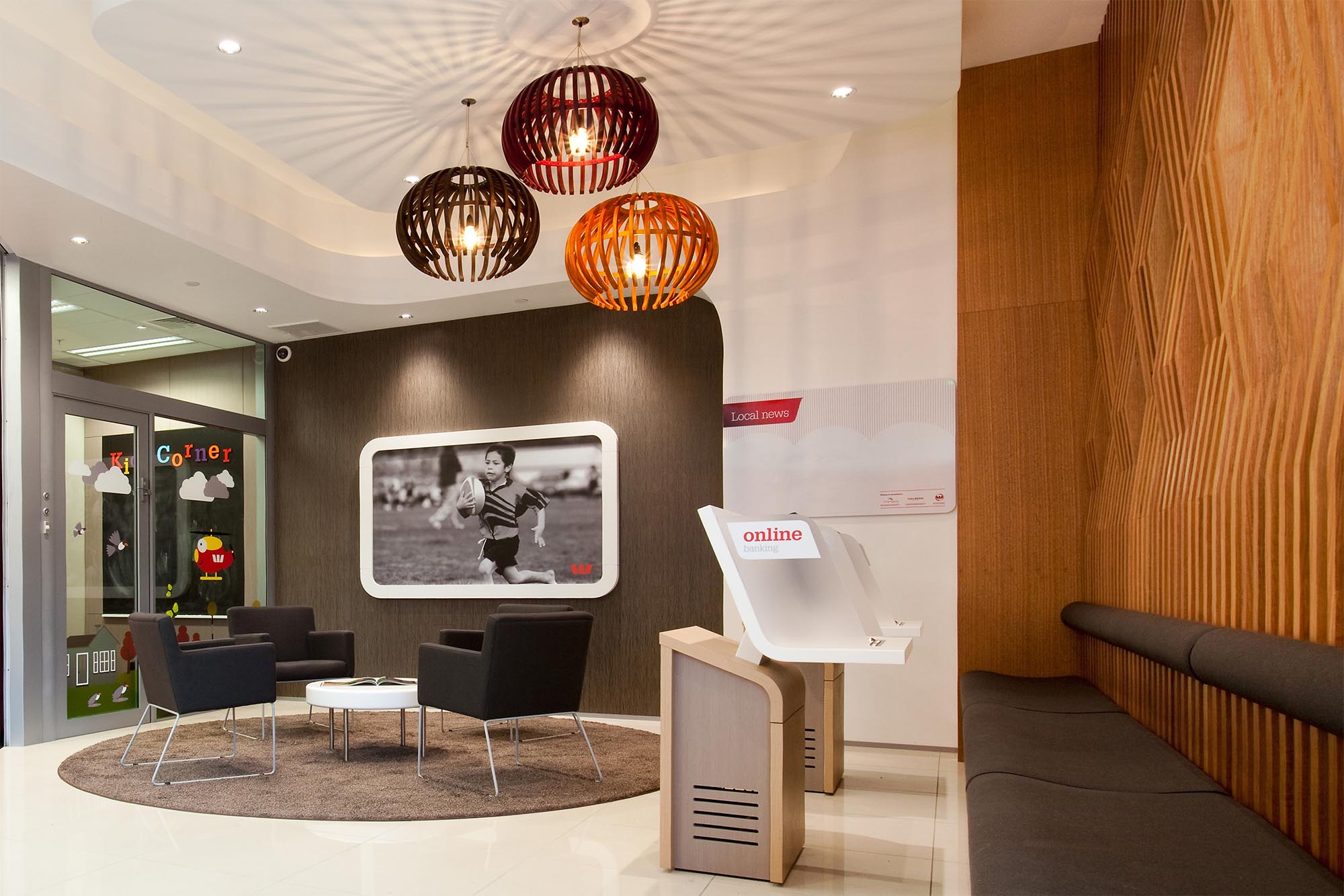
Westpac asked Context to create a unique customer experience for their new Barrington branch, blurring the boundaries between mall and bank, and providing a relaxing waiting area to encourage new and existing customers to linger. This is achieved by creating a progression of different zones, from the mall, to ATM lobby, waiting area, enquiries, and main banking chamber. The branch design needed to consider after-hours access to ATM machines and self-help zones. There are also strict security protocols to maintain; in particular, providing clear sightlines from the entrance through to the enquiry area, and beyond to tellers and private offices. An open timber screen defines the shopfront, creating views into the interior whilst also providing warmth, texture and intimacy inside. The screen evolves from a linear form into a folded pattern inside – the view changes with the movement of walking past to further engage viewers. Pendant light fittings were custom-designed in stained plywood to enhance the timber screen and provide an accent of colour. Soft furnishings and warm timbers were selected to enhance the Westpac brand colours while also creating a comfortable customer experience. The mall flooring was brought in to further reduce boundaries between mall and bank. Westpac Barrington redefines the customer experience in mall banking. No longer is the experience purely transactional or the interior corporate, but the design of the space lends itself to true customer engagement and experience. The screen is an innovative twist that effectively provides a ‘safe’ relaxing haven from the rush of the mall traffic. The roller shutter bulkhead was specifically designed to conceal the door and visually connect the shopfront with the enquiries area. A kids’ room enriches the customer experience by providing a safe, quiet zone for children to play in while their parents go about their banking business.
- Category
- Hospitality and Retail
- Location
- Canterbury
- Year
- 2012


