

Auckland: The House and the City
The second Block lecture, presented by Auckland architect David Mitchell on 1 August 2013.
The Modern and the Post-Modern
Allow me a moment in the 1980s. Post-modernism is triumphant, and well-trained Modernists like me are vacillating. A few florid gestures on the University Music School leave me still cheeky but a little uncomfortable. We risk an axial symmetrical plan and façade at Epsom Girls’ Grammar Library, which Bill McKay embellishes ardently. Our great Brutalist Miles Warren, always certain, is now building massive keystone arches, and colonnaded pediments in precast concrete, embracing Neoclassicism as if he’d come home to it.
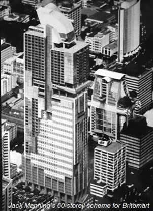 Jack Manning, once architect of the AMP curtain wall is no NeoClassicist. He is working on the first contest for Britomart – with 60 exotically wrought storeys in mind. A few years earlier, Miles’s elegant Union House jumped the scale of the little moderne Maritime House. Here, Manning’s whopper jumps Union House. Younger architects in the office did junior versions, and this (left)is Bill McKay’s. Note the prescient roof gardens and the real roof – surely a rainwater collection system. Like Rem Koolhaas (think CCTV), Manning is clearly sceptical of contextualist argument. He doesn’t mind jumps in scale one bit.
Modernism was said to have died, just before I wrote The Elegant Shed in 1984. Neoclassical post-Modernism flared briefly, before the critics yawned, and the architects blushed, and then shuffled away from it like guests leaving a rained-out barbecue. They left their decorations for future heritage campaigners to love and preserve.
Modernism still gets a bad press these days. The Modern is deplored for its objectifying of architecture and for its systematising, sanitising influence on city planning. Corb’s city visions were surely his worst. Now that ‘sustainability’ has become an unquestionable driver in every aspect of life, the sustainable community housed in sustainable buildings seems to be the only worthy goal. Worthy, and usually dull. (For more on this, try to digest Peter Buchanan’s series of articles, ‘The Big Rethink’ in recent copies of The Architectural Review.)
Despite all the raging against Modernism, it seems to me that an essentially Modern manner continues like a musical obbligato, worldwide, but especially in New Zealand. The international press may be filled with sloping buildings, free forms, and buildings sporting repeated structural transformations – suggesting the use of certain computer programmes rather than certain architects. But against this, the work of many architects still looks like late 20th Century Modernism to me.
One day in Melbourne I watched builders putting Federation Square together. It was an unsheathed mass of struts at that stage. I marvelled at the terrifying complexity – the daring of it. A couple stopped beside me.
‘An architect’s bloody nightmare!’ said the bloke, in a well-known accent. ‘Well…’ he said, ‘I just come from a little town in New Zealand. We’ve only got one traffic light’. I threw him an arch Australian smile, and dared not speak.
But I wondered, has the orthogonal vanished with the T-square and the saw? And I still wonder. Or was this the first wild hollering of the electronic age of architecture? Would it quieten down, losing its heraldic pose, just as the grandfather clock had become the watch, the radio cabinet had become the tuner, the picture palace had become the cinema.
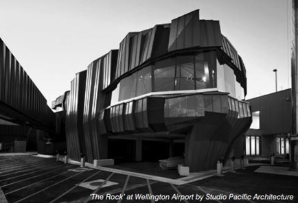 Fifteen years on, and it seems to me remarkable that even now, the only New Zealand building that looks as if a computer was used in designing it is the terminal called the Rock at Wellington Airport. Have we missed the boat, or are we still trying to catch it? Are we really people with only one traffic light?
California and Auckland Modern as Models for the Common Stock
The California Modern Show now at Auckland Art Gallery brings back the optimistic, unified spirit of mid-20th Century architecture in the New World.
The spirit of California differed a little from our more sensible national style, but the pottery, fabric and buildings in the show and the ethic and aesthetic that guided them had strong New Zealand parallels. We were designing houses that were very similar to Arts and Architecture magazine’s Case Study houses in their goals, but made of timber, not steel. The Californians were lotus eaters from Reyner Banham’s Second Machine Age, while we were hobbits with hammers, bringing the Arts and Crafts movement up to date. Like the Californians, we thought of our houses as models that would spread through the wider community, giving a transfusion to the common building stock. Experience has tempered this expectation.
Limitations to Low-Cost Domestic Architecture
The low-cost suburb is not the theatre in which radical architectural performance is found. High-end architect-designed houses may set the style which with which countless draughtsman try to grace-stroke their humbler offerings, but designing single houses hardly touches national housing needs, though it is probably the commonest work in New Zealand architecture offices.
In the 1980s, our office worked for mass house builders – the Housing Corporation, Fletcher Residential, Beazley Homes and Keith Hay Homes. I once checked Beazley’s sales figures and realised that the few hundred repeated houses we had designed for big house builders eclipsed everything else we had ever done. Yet today, I could not lead you to a single one of those cheap, decent houses. They dissolved into the suburban melange. And why did we stop designing them? Because it was boring. Architects are better at jigsaw puzzles than most people, but they get sick of doing them. They hanker for the new, or at least for the latest fashion. To them a house may be a home but it is at least a mechanism, or a metaphor, or a proposition. That is why they cannot be trusted to lead today’s ‘affordable housing’ campaign.
Hobbits with Hammers: New Zealand’s Adaptation of International Modernism
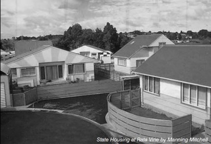 We once thought our brightly coloured detached State houses at Rata Vine would fit happily into the suburb. We had names for them – like the Tuscan, and the Sure-to Rise. At the first repaint they were all painted cream. Rata Vine became gangland, well known for drink, drugs and domestic violence. Did we contribute somehow? We had to ask ourselves. Up the road at Laurelia Place, Rewi Thompson’s team designed more radical bach-like corrugated-iron clad pole houses, ‘like a wharf over the wilderness’ as Rewi described the conceptual drawings at the time. These days Rata Vine is called ‘the Bronx’ and the houses are looking pretty tired. Rewi’s ‘wilderness’ turned out to have more wild animals in it than Housing NZ could cope with, and last year they pulled down 25 units. The Sure-to-rise has slumped.
Peter Middleton proposed a very humble role for mass architecture: “the preservation of self-respect”. I can only add one observation to that: the person at the bottom end of the housing market wants a house just like the one that someone slightly richer lives in. No experiments are permissible down there.
Affordable Housing
‘Affordable housing’ used to mean bottom-end. It’s moved to the middle. The recent NZIA CPD seminars on ‘affordable housing’ exposed the financial problems of building for the middle class. We saw no buildings for the poor, and it has to be said that what we did see in power points was not new. As Chris Kelly readily pointed out, there are books full of medium-density middle-class housing models. And many have been built over the last 50 years, including in New Zealand. However, Housing New Zealand, stripped as it is, remains the only provider for the truly poor. If there is any hope of dignity for architects here, it is in the upward mobility of desire. Change starts at the top and becomes a goal of the next group down. Apartments started on Remuera and Jervois Roads and St. Stephens Avenue, and the first townhouses were in Remuera and Parnell.
The Elegant Shed Continues...
Come back to Paradise: Like the architects in the California Modern show, mid-Century Auckland architects were enamoured of direct structural expression, and explicit construction detailing, and this tradition continues among many. The title The Elegant Shed was stretched to describe New Zealand architecture, when the architecture it fitted was really Auckland’s. That bloodline has continued – through houses by us, Patrick Clifford, Pete Bossley, Ken Crosson, Lance and Nicola Herbst, Briar Green, Rick Pearson (Rotoroa Island museum), and quite a few others. Dave Strachan, with Unitec students, designing and building a house a year, is in this lineage. Group Architects would be rightly proud of him. But there are excellent architects, like Stevens Lawson, and Fearon Hay who care much more about the texture and finish of surfaces, than about explicit construction systems. We notice each other’s work, but influence is complex. Here is a well-known Fearon Hay Bay of Islands house, here a long-remembered view from a bus in Paraguay, a Mitchell and Stout house on Waiheke, a recent Stevens Lawson house on Waiheke. When is the outside in, and the inside out? We Aucklanders keep asking. Architecture finds its sources in architecture.
Recently, Jeremy Hansen, John Walsh and Patrick Reynolds have published most of the best houses they could find, with many interviews and much shrewd comment. When I was young I would have sieved the lot, and worked up a theory about it. Now it doesn’t seem possible. The range is too wide, and architects are less certain about what they are doing. Sure, there is the moral certitude of the eco-warrior – but where is the poetic expression? House architecture remains the preserve of the privileged classes, who are confident and wealthy enough to give architects room to run. And so it will continue, I’m sure. We’ll wrestle with multi-car garages, benchtops, bathroomware and barbecues, all for the right to manipulate mass and space – the ancient ritual that is at the heart of our great art. Yes, it’s true that many of our houses are very well done. But we’re not going to change the world one house at a time.
The Heritage Campaign
Meantime, heritage campaigners are trying to squeeze new architecture right out of the inner suburbs, and even the new single house is seen as an interloper. Campaigners have objected in the NZ Herald to a number of architecturally distinguished new houses recently built in inner Auckland suburbs because they didn’t ‘fit in with the architecture of the area”. They have picked up the language of the urban design police, with phrases like “out of scale” (too big) and “out of context” (doesn’t look like the neighbours). The very sameness of a street full of bungalows or villas is apparently a virtue. So Mt Eden should be villaville for ever, and Mt Albert should be perpetually bungaloidal. Ironically, the most valued suburbs in the city- Epsom, Remuera, and the eastern seaside suburbs have the greatest architectural variety. It is trees which unify Epsom and Remuera.
 Here now is St Mary’s Bay – a haven of heritage buildings. Mark the manners: the street frontage is a stumble of old house fronts, with a maw of garage doors beneath. Never mind the excavated front yards and undercrofts; never mind the disembowelled interiors, with modern-style open kitchen-dining living areas linked to new decks through folding doors; never mind the dormers and roof rooms so ill-fitting they could only be new. This melange of assaults and additions passes for heritage protection, and its owners will do all they can to preserve its domination by stamping out non-conforming neighbours. Contemporary architecture is inadmissible unless it looks something like this.
In St Heliers, heritage campaigners objected to this building by Cook Sargisson Pirie replacing a dingy little group of Art Deco houses. Down the road, Ian Moore took a drubbing for a building that is currently a World Architecture festival finalist (would you believe?). A good deal of the ‘village’, as St Heliers is affectionately known, is made of overstuffed seafront tack, and bottom-of-the-barrel rent-pullers with parking.
The Auckland Unitary Plan
Quite suddenly, the Auckland Unitary Plan seemed to open a new door. It attacked the suburb by shrinking lot sizes, and increasing densities. Even I wonder if suburban quality can survive with detached houses on 300 square metre lots. Householders at large were terrified, protective of their plots and fearful of being ‘built out’. Helped by a mass of misinformation in press reports, visions of high-rise (three storeys, and sometimes more) were displayed by objectors at public meetings for locals to rail against. None of these pictures looked like the streets of cities like Copenhagen, which had inspired the planners. Instead, there was constant reference to the architecture of East Germany and the Communist bloc. Status quo nimbyism dominated, whenever increased densities or increased height were discussed. There could be no high-rise in Belmont. The first Unitary Plan was a crude document, with a great deal of important detail missing. Nevertheless, public reaction suggests that the suburb is a tough ground for any revolution, and that it may well be wise to leave it largely alone. That would shift attention to areas which are urban, semi-urban or decayed.
To me, and probably to many here, the prospect of a denser city is exciting. With density comes intensity. With the suburb largely out of bounds, I think we have to turn to the main roads, the commercial streets and the central city as sites for transformation.
The City
Outside the Queen St valley, Symonds St, and Newmarket there has been almost no change in the scale of commercial buildings in Auckland in 90 years. The heritage reputation of Ponsonby Rd rests on some old houses and a few two-storey blocks of shops which have been largely rehashed on the ground floors. There’s not much to save. It’s a cow-town main street, longing to be built up. RTA Studio’s new shops just off the main road are a delight, and their new roof to the coffee courtyard has splendidly up-scaled the street wall. But imagine six or eight-storey buildings here, and the street gains presence. It also gains a pedestrian population.
In Parnell Rd, only a shrewd eye can distinguish old buildings from the multitude of pseudo-Colonial additions Les Harvey made in the 1970s. More important were the alluring public spaces between Harvey’s houses. They were new to us at the time.
The Nestle building, not far away, was a closed world until Andrew Patterson renovated it, making its courtyard inviting and public. It became a model for other courtyard buildings like D72 and Site 3.
Patterson Associates’ buildings engage with the passing public by presenting enigmatic images which veil the private lives behind. This used to be very unusual in Auckland architecture, which constantly raised its cap to the view, opened its wings to the sun and showed its interior at the same time.
Geyser is a virtuoso piece of trick cycling. It’s a multi-Greenstar winner on a multi-storey carpark – such are the ironies of modern compliance. It’s icy, with a discomforting defensive/aggressive pose, and a captivating surface.
This is a cluster of buildings with routes between, which are barely perceptible from Parnell Rd. Since the exterior glass is intensely and suavely fritted, views from within and without are extremely limited, and moving between the walls reminded me of walking the alleys of Al Mukallah – a Muslim town in Yemen, catching rare glimpses of dark figures through high latticed hatches in white walls.
In fact much contemporary veiling parallels Islamic work – BVN’s sunbreaker on the new ASB headquarters, Richard Naish’s perforated screens in several buildings, and the woven wire and perforated metal screens of many contemporary buildings. Compare them with the non-figurative art of Islamic tile patterns, the perforated stone screens of the Alhambra, the fretted shutters on Arabic houses (so women and children avoid the male gaze). Architecture finds its sources in architecture –anyone’s architecture, in my book.
As for ‘Cumulus’, and ‘Geyser’, the ‘Rock’ and the ‘Cloud’ – these are emblematic labels for the visually illiterate, but I can’t believe they are metaphorical drivers of architecture. I park them in the PR file. Karangahape Rd has barely changed, but RTA’s Ironbank shows where it might go. The street facade clearly tries to play with its neighbours, in the manner urban designers favour. I’d rather have seen the rusty boxes tumble into the street, and of course I’d love the building to be twice as high. But I admire the deep reach of the plan back to Cross St. With more of this, Cross St could come back from the grave.
Connections
The exquisite precedent of St Kevin’s Arcade reminds us that it’s not just buildings, but connections that we need. Here is a newly worked connector by Jasmax through the buildings of AUT. And another to Albert Park via the Art Gallery forecourt. We are invited by our profession to make the public theatre of our day. It is our most important role, and we have at last turned to it.
The Imperial project of Fearon Hay extends Auckland Council’s excellent shared streets programmes through a city block from Fort Lane to Queen St with a rich piece of old-and-new. The ramp is madly alluring, and the four roof-lights cut through the floors over it are Piranesian. There is light in the dungeon, and in the distance Queen St beckons. The highest praise is to say it has become part of my route from our High St office to the ferry building.
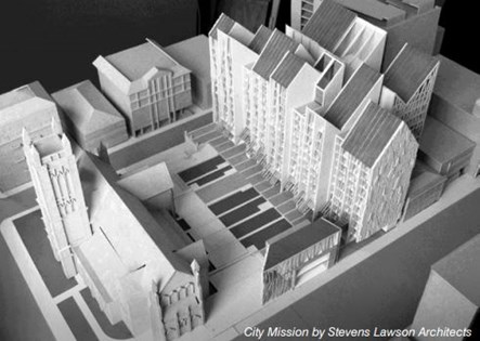 This Stevens Lawson scheme (left) for the City Mission combines assisted housing for the truly poor, including the homeless, with the Mission’s own facilities, and community social and retail functions, and facilities for neighbouring St Matthews church. What is exceptional here is firstly the public courtyard space between the church and the new buildings, where there is now a carpark. It’s the right size, it’s sunny, it sets up the church, it’s a little protective. This is an area of the city where almost all public space is roads and the City development contributions of many nearby apartment buildings have produced no pedestrian open space.
Secondly, the Mission buildings are ingratiating, but do not patronise their occupants. In function and style they could as well be in Parnell as Hobson St. It’s been stalled for some years. I very much hope it gets built.
The heroic Britomart that Jack Manning envisaged was not to be. The development to date is most notable for the renovations of surrounding buildings – much of it by Cheshire Architects, and for the temporary structures forming a street through the centre – which they also designed. The last consistent relic of our once-European city is this fine wall on the north side of Customs St. When the latest version of Britomart was planned no buildings were to rise in the background above these, though I can’t fathom why not.
Similarly, the Viaduct building heights were pegged at six storeys. If the office blocks on Fanshawe St had been higher, and glassier, with wider views between them, and glazed ground floors, we could have looked into the Viaduct basin from the other side of Fanshawe St.
Every visit by Jan Gehl reinforces our present conventional wisdom, as he tells us again that the continuous four-seven-storey street wall is what the great cities got (before the lift was invented), that we should ride bikes and walk and try to be like Copenhagen. I go with the bikes and walkers, and I’m glad Christchurch is trying to be like Copenhagen. As for Auckland, to hell with it. I’m happy with high-rise.
I love a lift like I love City Mission by Stevens Lawson Architects an underground railway. I want to look out. I want contrast, more than context. Sure, street level has to be active below the veranda (another mantra of the urban design crowd) but let’s have some fun upstairs. The new Unitary Plan sets maximum metropolitan height limits at 18 storeys. The Vero building is twice that high already. What’s wrong with 70 storeys? With Auckland’s topography and views it’s the gaps between the buildings that count more than their height. And it’s action on the ground floors, and population above that make a rich pedestrian world.
At Britomart, the East Building, designed by Richard Johnstone, is massive and the huge floor plates and limited height must have been tough to handle. The massif has been divided by a ‘walking street’ vertically, and into sandwiches of different styles and materials horizontally. I understand this latter as a visual trick for countering size and nodding to lower buildings across the street, but I have to ask is that the architectural sum of it? Lacking the population of a typical Asian mall, the ground floor street is too wide and the shops are a bit gaunt. By contrast, the friendly black and perforated (and brick veneer!) shops by Cheshire Architects in the central Britomart area are fun to walk by and use. So are the nearby bars in refurbed old buildings. This works, just as Harvey’s Parnell Village worked. It’s fussy and cluttered with architectural knick-knacks and furniture. One hopes, with no great confidence, that the seven- and nine-storey blocks intended one day to replace the temporary shops, can avoid the detached air so common in big new buildings. Will the walking street fill up with people?
Westward, we have the ‘Cloud’ and the ‘Events Centre’, neither of which we seem to know quite what to do with, judging by how rarely they are occupied. Shed 10 will give us another ‘centre’ when cruise ships aren’t here, and a desperate lack of population will be even more obvious. The main function of the Cloud seems to be to carry a wandering band of light up and down its edge to entertain ferry passengers like me on winter nights. Entertainment is a fine thing – the coloured plastic wall of Bossley Architects’ nearby Maritime Museum addition is also lovely. But the big question over the Cloud is what’s it for? It leads to a larger question – if ‘the red fence comes down” as Heart of the City would like, and more wharves are opened to the public, what are we going to do with them? It’s commercial shipping that gives them life. Public open space is not judged by how many hectares there are of it.
Many Aucklanders long for inspiring public architecture, but so far they haven’t been prepared to pay for it. Meantime, we architects have so devalued ourselves and one another that we compete for work on the basis of fees. We submit to the judgement of project-managed committees, where architectural quality is a subject likely to rate below all other factors. Worse still, we enter competitions so poorly funded that gratuities paid have no relation to work done. (The Viaduct Bridge and Queens Wharf competitions loom in the memory.) Since we value ourselves cheaply, so does the public at large. Two weeks ago my local paper, the Devonport Flagstaff published an intelligent project by Sills van Bohemen and Jasmax for Devonport Wharf. It’s the latest winner – one of the designs of a few invited architects, who according to the Flagstaff received $3000 each for their original ideas for one of the city’s greatest sites. The Flagstaff had to use the Official Information Act to get access to information and the pictures of the schemes it published. I hope against the odds that it goes ahead.
Even worse than unpaid competitions is a process in which projects for which concept designs have already been done by one architect are re-tendered to the rest of us. Local authorities call this ‘transparent process’. It is the final sacrifice of art to commerce. Collegiality and confidence rather than secrecy and competition will serve architecture best. Self-respect is the least we can expect of ourselves.
So what’s to like? Walking the nearly-restored Quay St axis down to the new Silo Park, the lure of the Tank Farm future, and a good deal of well-executed landscape architecture, mostly well away from the water’s edge. One vital ingredient is missing in general – trees, especially big deciduous trees, like the planes of Ponsonby. Even grass. The shade of trees is essential in public spaces, especially in summer. Regrettably, tītoki and nīkau may be good for nationalist conscience, but they don’t make much of a street.
Nothing shades the public space in front of any apartments in the Viaduct Basin. Trees would interrupt the private views of apartment owners. Waitemata Plaza? Effectively, it has never been used. Residents resist use – they don’t want noise. There are no trees from Princes Wharf to the end of North Wharf, save a few shrubs in tubs. If a line of big lamp standards could be planted down the inner edge of North Wharf – as it has, why not a line of trees. What is simply outrageous is the use of Te Wero Island and the peninsula leading to it for car parking. Perimeter service access to boats should be allowed, but the finest site in the area needs real trees. If it had grass too we might even see an occasional family down there.
Auckland pedestrians are continually dominated by cars. The skyway scheme for the harbour bridge is a first step in overturning this. Let’s have it. It’s almost impossible for walkers to cross from the western city to the waterfront. Fanshawe St should be underground at Victoria Park. Bridges should link the old foreshore cliff by the Auckland Council building over Fanshawe St to the Viaduct, right here, and from the bottom of Nelson St to the Viaduct.
The most barbaric pedestrian route is from the University to the Domain down over the tangle of roads in Grafton Gully. There is no pedestrian way here, and I think only a big move can save it. The motorway is an artefact of metropolitan scale, not to be meddled with timidly. Here is Auckland University student – Michael Cox’s brave attack – high level pedestrian routes linking towers of habitable space between the roads. It’s visionary, and metropolitan, and optimistic.
I think we can largely leave the Auckland suburbs to look after their closeted burghers, so long as we power up the commercial centres and downtown. The model is metropolis, and New York is its apotheosis. Making the elegant shed has been a fine indulgence, but making the elegant city is now our great task. We had one once, and we’re heading there again. I do hope Nature doesn’t get there first.
David Mitchell, director of Mitchell & Stout Architects, is one of New Zealand’s foremost architects. His work has encompassed tertiary education buildings, secondary schools, community projects, art galleries, office buildings and numerous residential buildings. He was a senior lecturer, teaching design and environmental control at University of Auckland’s School of Architecture for 15 years from 1972 -1987, and has been an adjunct professor at Unitec’s School of Architecture. He has written two books on New Zealand Architecture and presented a six part TV series, The Elegant Shed, NZ Architecture since 1945.
The transcript of this lecture was made available by Block, the broadsheet of the Auckland Branch of the New Zealand Institute of Architects'. More Block resources can be found here.